
2007 seems ages ago. It was the final year of another era, the time before the Crisis. Whatever you prefer to call it – credit crisis, debt crisis, global financial crisis, banking crisis – the crisis has scarred the shareholders of banks. Even though ten years have passed, most bank stocks still have not recovered to their pre-crisis highs.
This post looks at the evolution of the stock prices of the largest banks1 in Europe and the US. For European banks, I made a distinction between institutions with headquarters inside and outside the euro area.
The technical details of how I collected and processed the data are described in the Methods section at the bottom of this post.
Figures 1 to 3 show how the stock prices of the major banks in the euro area, non-euro area Europe and the US, respectively, evolved from 2004 to 2017.
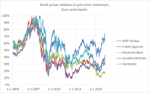
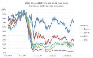
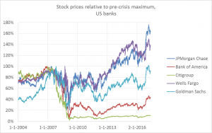
Comparing the relative performance of the bank stocks shows some interesting similarities and differences.
All stocks in our sample follow a general pattern. They form a top in or around 2007. Then stock prices take a nosedive and hit rock bottom in March 2009.
From that low point, there is a recovery, followed by a new low at the end of 2011. This is the period of the sovereign debt crisis in the euro area. There was speculation that the ‘PIIGS’ countries would default and the euro would break up. After these fears subsided, investors were in ‘risk-on’ mode again.
The graphs show that stock prices fell from the summer of 2015 into early 2016. I don’t remember any specific macroeconomic reason for this downturn. Let’s attribute it – and the subsequent rebound – to market sentiment.
Finally, US banks sharply rose after the election of Trump.
Besides the shared “waves”, there are important idiosyncratic differences. Barring a miracle, it is hard to see how the stocks of RBS and Citigroup can ever recover to their levels prior to 2009. This reflects the fact that these lenders had to be bailed out during the crisis. Capital increases massively diluted the stake of the old shareholders.
There are also large differences between banks that didn’t have to issue new shares. Some banks struggled more than others to find a profitable business model. The divergence between BNP Paribas and Deutsche Bank for example merits a separate post.
Taken as a whole, the American banks clearly outperform their European peers. The stocks of JPMorgan Chase and Wells Fargo already broke their pre-2009 highs in 2013. In contrast, all the biggest banks in Europe trade at a lower price today than the maxima attained before the crisis. For their shareholders, it has truly been a lost decade2.
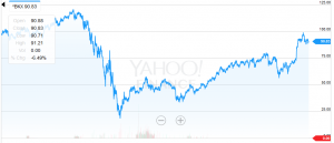
A broader selection of stocks confirms the outperformance of US banks over European lenders. Figure 4 shows the KBW Bank index, an index of US bank stocks3. The KBW Bank index peaked in February 2007. At the end of May 2017, it stands 25% below that historical top.
But that lost decade in the US is nothing compared to the losses in Europe.
Markets can remain depressed longer than you can remain alive
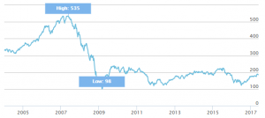
Figure 5 shows the Stoxx Europe 600 Banks index. That index of European topped out in May 2007. Exactly ten years later, the Stoxx Europe 600 Banks stands two thirds below the 2007 high!
For reference, after the Nasdaq 100 (technology stocks) topped in 2000, it took 15 years to surpass that level. With any luck, US banks will also be able to reach new all-time highs within a couple of years.
Eyeballing the graph of European banks leaves less room for optimism. In fact, a Japanese scenario cannot be ruled out. The Nikkei 225 currently trades at about half the value of its top reached… 28 years ago, in 1989!
They say that stocks almost guarantee superior returns over the long run. But you know that in the long run, we are all dead.
Or to modify another quote attributed to Keynes: “Markets can remain depressed longer than you can remain alive”.
===
My book Bankers are people, too is an introduction into banking.
===
Methods
Stock prices were downloaded from Yahoo finance. I had started with Google finance, but I could not export all stock price histories using Google finance. The data on individual stock prices runs from January 1st, 2004 to May 8th, 2017. The price data are in local currency: euro for BNP Paribas, Crédit Agricole, Deutsche Bank, Société Générale and Banco Santander; British pound for HSBC, Barclays, Lloyds and RBS; Swiss franc for UBS; and US dollar for JPMorgan Chase, Bank of America, Citigroup, Wells Fargo and Goldman Sachs.
I corrected the raw data for (reverse) stock splits of RBS, Bank of America, Citigroup and Wells Fargo during the studied period. That explains why there are no discontinuities in the plots in this post, as opposed to the original Yahoo data.
Finally, the stock price histories were normalized so that each bank stock peaks at 100% before 2009.
- “Largest” as measured by total assets in 2017.
- Assuming a buy-and-hold strategy of course.
- There is also a Dow Jones Bank Index, but that last index is dominated by the largest banks.